
Where it all started
Bold type. Handmade edges. No apologies. Since 2014, TheTrueType has been pressing words onto paper by hand — typographic prints and limited editions made for the walls of people who read between the lines. No noise. No compromise. Reduced to the essential, executed with precision, finished with the kind of detail you only notice when it’s missing.
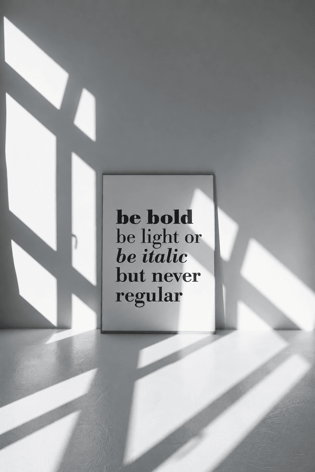
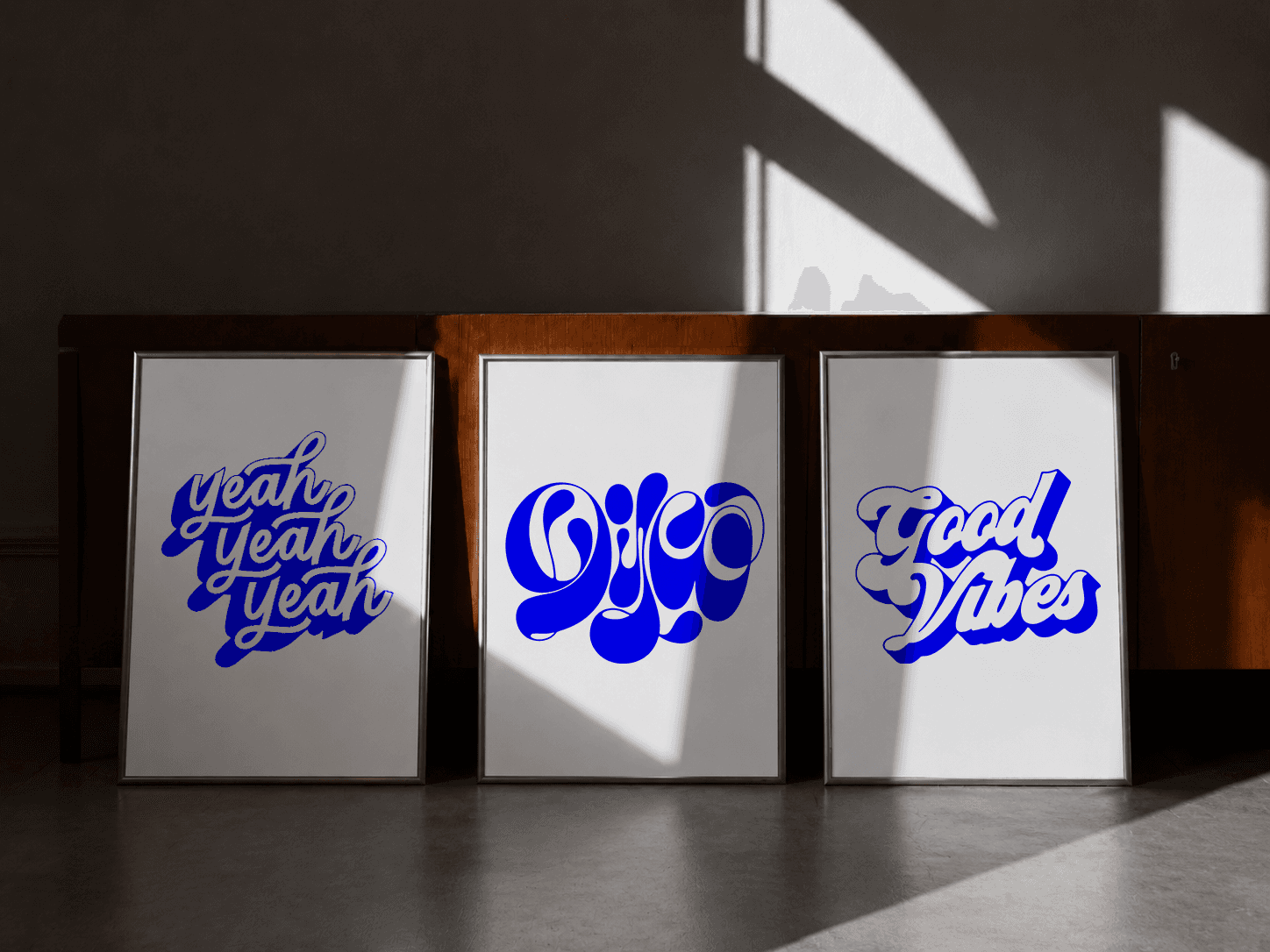
The work doesn’t fit in one box. It never did. TheTrueType has been building a body of printed work since 2014 — not as a product line, but as a practice. Each series grew from a different question, a different constraint, a different obsession with what type can do when you take it seriously. Everything started with a block of lino, a cutting knife, a roller, ink, paper, pressure. The linocut editions are made the slow way because the slow way produces something the fast way cannot — evidence of a human hand. Every print in this series is handpressed in Berlin, in limited runs that don’t get reprinted once they sell out. The words are chosen with the same care as the process: phrases that hold up over time, set in type that doesn’t overstay its welcome, printed as objects rather than reproductions. If you’ve ever owned something handmade and understood immediately why it cost what it did, you know what these are. Building an entire alphabet however started as an experiment and became a complete body of work. The full alphabet — A through Z — each letter rebuilt as a geometric, optically charged composition that sits somewhere between type specimen and visual art. The series draws on the tradition of Op-Art: hard edges, black and white, figures that shift when you look at them long enough. But the starting point is always the letter itself — its structure, its negative space, its history as a form that has been drawn and redrawn for centuries. Collected as a full set, the series transforms any wall into a typographer's manifesto. Individually, each print works as a single, self-contained piece of graphic precision. Some prints are built entirely around a single sentence — around the specific gravity of a particular phrase. Not decoration with words on it. Not inspiration porn. Actual language, chosen because it earns its place on a wall and keeps earning it every time you read it. The tone ranges from dry to direct, from quietly funny to genuinely confrontational.